
Case study · Branding
Climaventis: a new name, from the logo to the stand at Oikodomi 2026.
Multiclima became Climaventis: logo, corporate identity, print, stand graphics and videos for the Oikodomi 2026 trade fair, and a social media plan.
 Branding · Corporate identity
- Client
- Climaventis
- Sector
- HVAC: heating, air conditioning and solar systems
- Platform
- Branding · Corporate identity
- Scope
- Corporate identity and brand guide · Logo design · Print-ready stationery and literature
Project thinking
From brief to working system
The decisions behind the interface matter as much as the final screen.
A mark for cold and warm
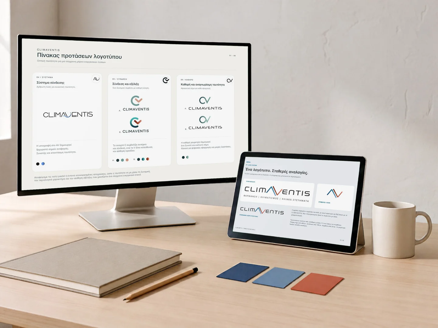
Multiclima, a heating, air conditioning and solar systems company in Patras since 1989, with its own Werstahl and Mastersol brands, changed its name to Climaventis. For the new name we explored many directions: symbols built on the “C” and the “A”, an infinity symbol and lettering variations, in different palettes. The final mark keeps a simple “Λ” in place of the A, with two lines, one blue and one red, for cold and warm. Logo and identity design: Firstidea, in collaboration with Prime Marketing.
- Symbol and lettering directions
- Colour and layout variations
- A “Λ” for cold and warm
An identity guide and print ready for the press
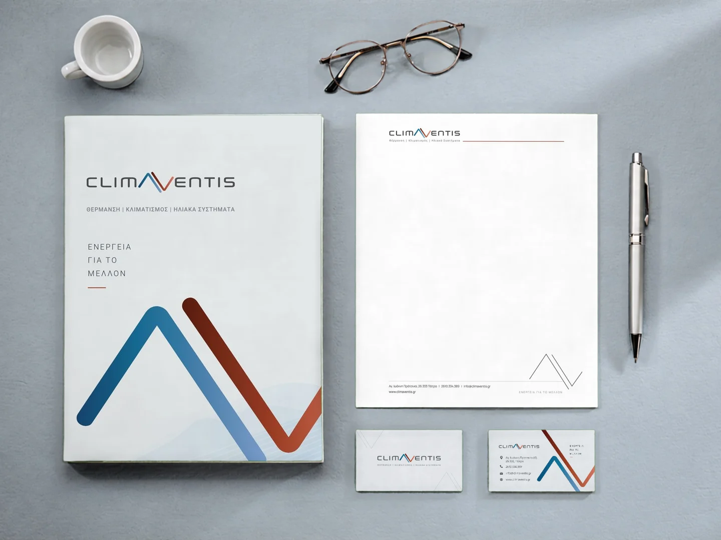
The identity guide sets out the logo versions and proportions, the palette of cool blues and warm reds, the typography and how a digital layout is built. It came with ready-to-use files for web and print, and with application examples from the envelope to signage and the technician’s workwear. We designed business cards for four team members, letterhead in office and print versions, a presentation folder, email signatures and the 2026 price list with technical data tables. All print was delivered in CMYK with bleed, and the same identity became the basis of the new climaventis.gr eShop.
- Identity guide for web and print
- Cards, letterhead, folder and email signatures
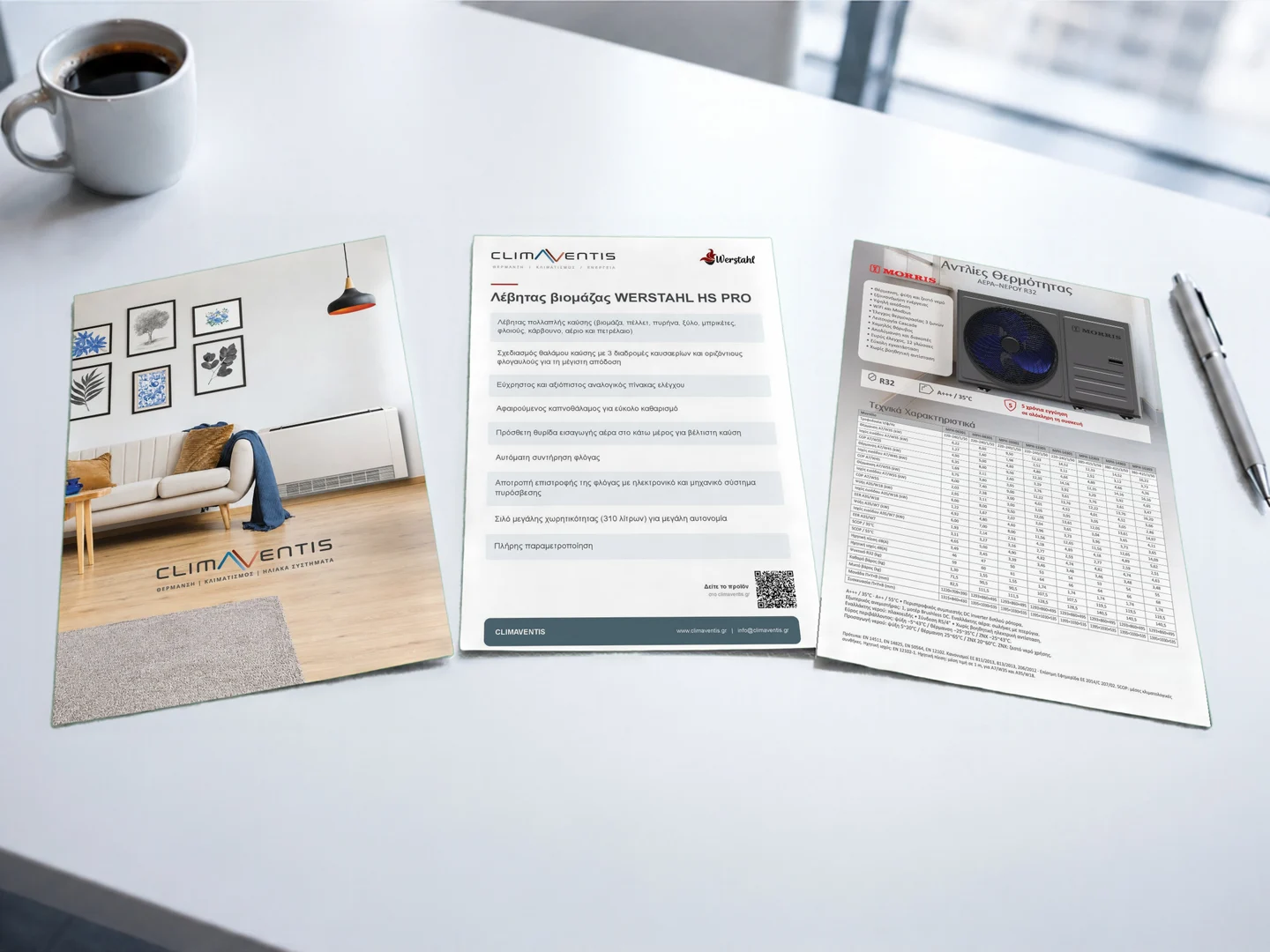
- The 2026 price list
Oikodomi 2026: stand D12 in Hall 2
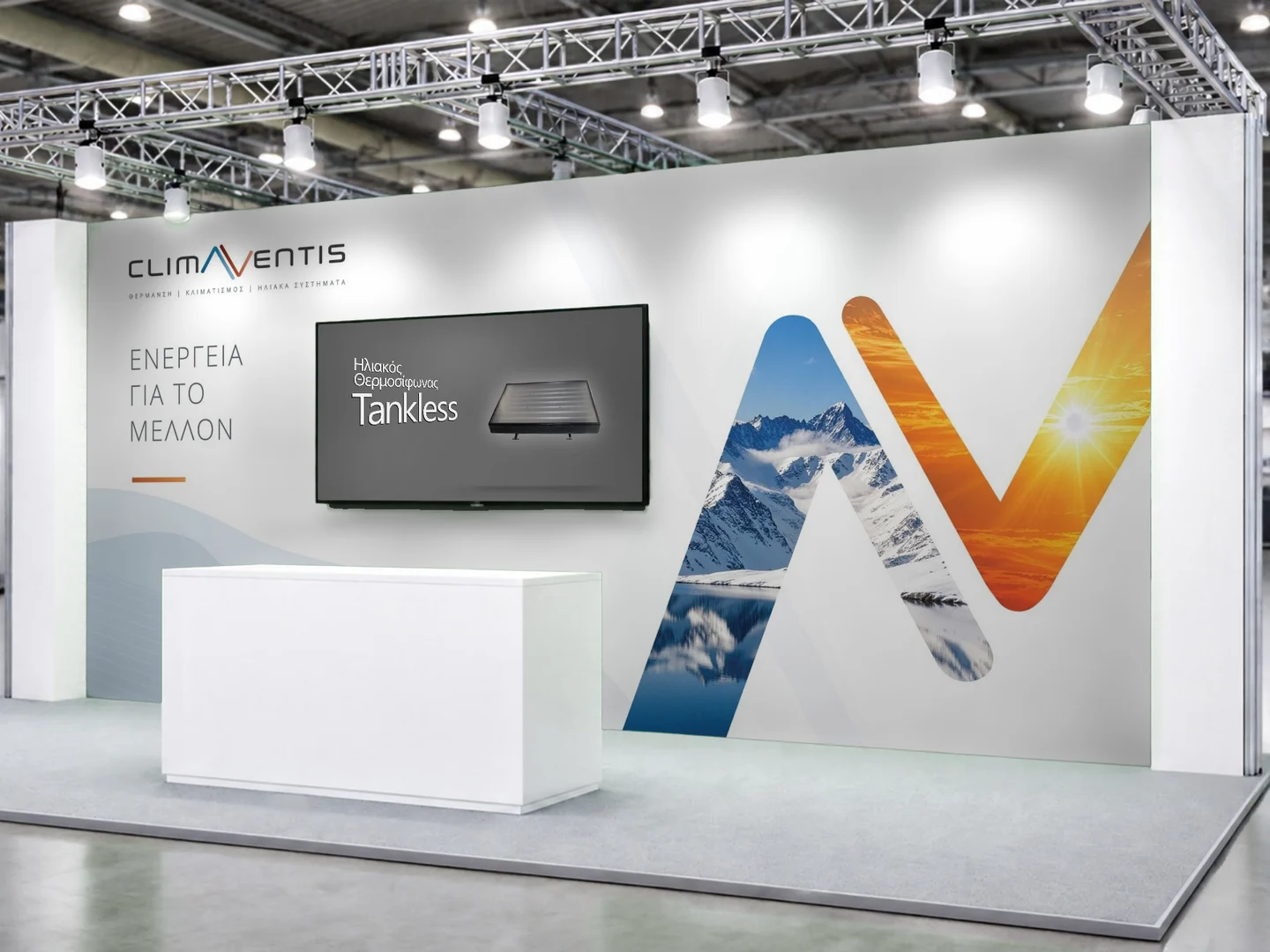
Oikodomi 2026, in October, was the company’s first trade fair under its new name. On the 680 × 300 cm wall, the shape of the logo became a large “window”, with snowy mountains on one side and the sun on the other, next to the message “Energy for the future”. We prepared the wall and header fascia artwork at 1:10 scale, the 150 cm cut-out logo and an installation guide for the stand builder. For visitors we designed a trifold, ten one-page sheets for the product series with QR codes, product labels, stickers and the banner for the invitation email.
- 680 × 300 cm wall and header at 1:10 scale
- Installation guide for the stand builder
- A trifold and ten product series sheets
Two videos for the stand screen
The stand screen looped a 2:34 video we made in After Effects. It presents production by product category, from solar water heaters to boilers and buffer tanks, with the titles and colours of the new identity. Alongside it we produced a short 41-second product video in 4K, featuring Mastersol, Morris and Werstahl.
- 2:34 trade fair video in After Effects
- 0:41 product video in 4K
- Titles and colours of the new identity
A social media plan and the first reels
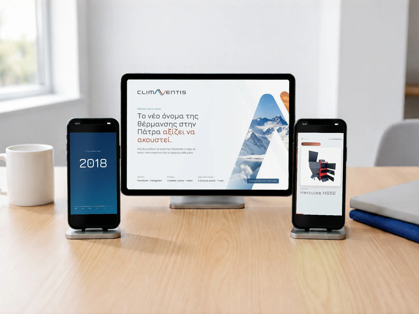
For Climaventis on Facebook and Instagram we prepared a plan with three audiences, four content pillars and a rhythm of four posts a month plus reels. The pillars run from the company’s own brands and choosing the right heating to the people in the showroom and the network of professionals. The first reels tell the story of the name change: “New name” explains it to people who knew the company as Multiclima, followed by “37 years” and “Werstahl, winter”.
- A plan for Facebook and Instagram
- Four content pillars
- Three first reels
Delivered value
What the solution connects
The outcome is described through delivered capabilities—not invented performance figures.
A logo with two lines, one blue and one red, that shows cold and warm at a glance: air conditioning and heating.
An identity guide with logo versions, palette, typography and digital layout, delivered with ready-to-use files for web and print.
Print in CMYK with bleed, from business cards and letterhead to the presentation folder and the 2026 price list.
The trade fair graphics, from the 680 × 300 cm wall and header fascia to the trifold and series sheets, plus two videos for the stand screen.
One system that works from a business card to a 6.8-metre wall.
The same “Λ”, the same colours and the same typography carry through every application: company stationery, trade fair material, videos and social media.
Your next project
The right solution starts with the real operating need.
Tell us what must change, what needs to connect and what success should look like for your team and customers.
Climaventis
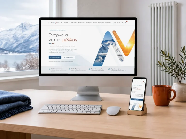
An OpenCart eShop for heating, hot water and air conditioning, with a heating power calculator, wholesale prices for partners and weight-based delivery.
OpenCartIndustry & technology↗︎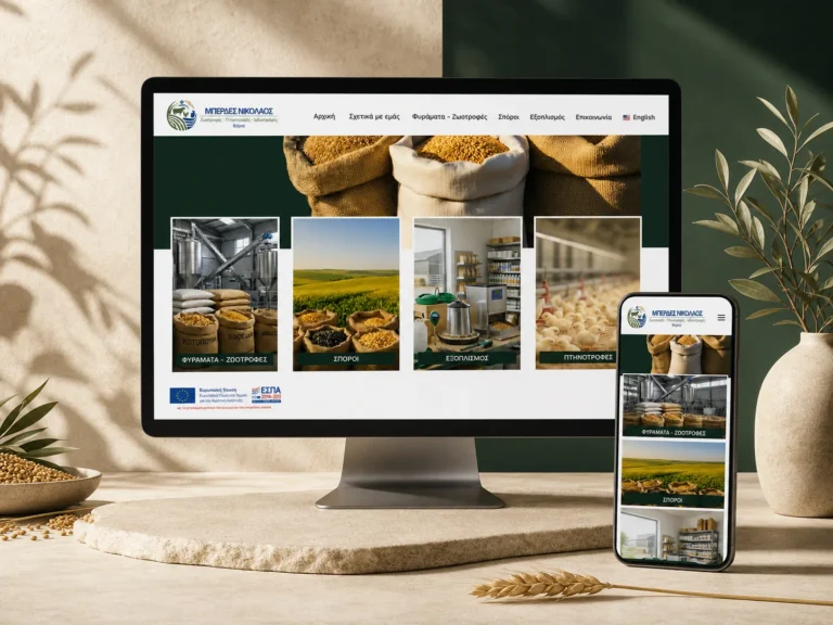
Berdes
The WordPress website connects the company’s history since 1953 with a structured presentation of animal feed, seeds, equipment and professional solutions for Varda and the surrounding area.
WordPressIndustry & technology↗︎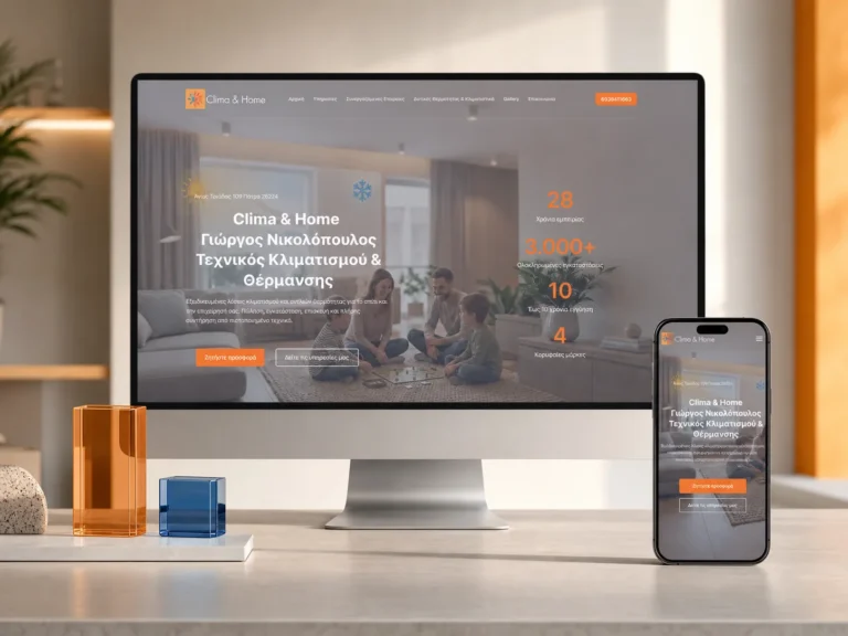
Clima & Home
The WordPress one-page website presents installation, repair, maintenance, cleaning and energy solutions in one continuous experience for residential and business clients in Patras.
WordPressIndustry & technology↗︎