
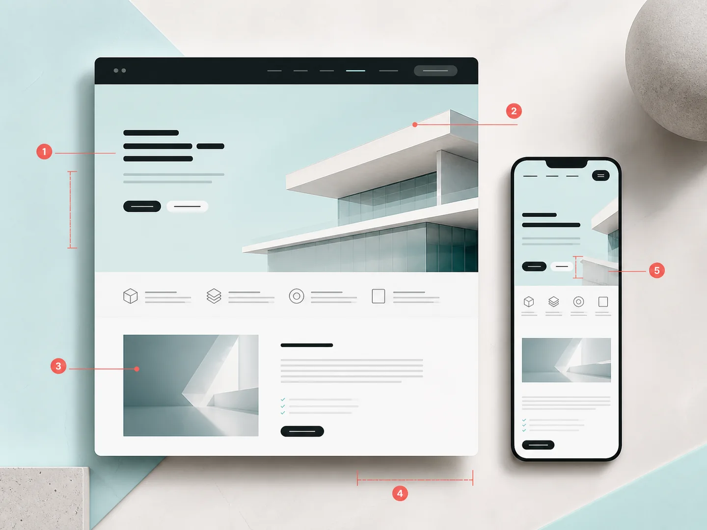
The short answer
Good web design does more than look impressive. It helps people understand, trust and act.
The most common problems are not matters of personal taste. They are slow loading, poor mobile journeys, unclear messaging, weak proof and structures that make life harder for both people and search engines. A serious design review tests those issues in real journeys and fixes them in order of business value.
When does a visual issue become a business issue?
When it prevents a visitor from finding information, comparing options, completing a purchase or contacting the business. Web design organises content, function, hierarchy, interaction and performance. Appearance matters, but it cannot be separated from the message, the technology and the page’s actual job.
We therefore do not begin with whether we “like” a layout. We ask whether people understand the offer, find the next action, complete the same task on mobile, see the page quickly and receive enough evidence to feel safe.
Measure the journey before judging the screen
A useful audit combines evidence and observation: Search Console and analytics, genuine conversions, recordings where lawful consent exists, technical performance testing, keyboard and screen-reader checks, and realistic task testing on real devices. A polished screenshot does not prove that the page works.
1. The page loads slowly and shifts while it appears
Oversized hero images, unnecessary video, many font files, builders, unused scripts and third-party tags delay critical content. Images without dimensions, late banners and dynamic widgets can move a button while someone is trying to select it.
- Set a performance budget before adding visual effects.
- Deliver correct dimensions, modern formats, responsive images and priority for the real LCP element.
- Review LCP, INP and CLS using field data where available, not one favourable lab run.
- Remove code that supports no visible function or measurable goal.
The official web.dev documentation defines Core Web Vitals as LCP, INP and CLS. Our SEO, performance and digital growth service covers the wider technical review.
2. Mobile is treated as a smaller desktop
Responsive design is not simple shrinkage. Space, touch input, connection quality and user priorities all change. An oversized hero, tiny type, difficult targets, hover-only information or sticky elements that cover the viewport can destroy an otherwise sound journey.
- Design with real content and test critical widths rather than one mock-up.
- Keep essential information equivalent across desktop and mobile.
- Test navigation, forms, checkout, consent and sticky actions with touch and keyboard.
- Never make essential instructions available only on hover.
Google uses the mobile version for indexing and ranking and recommends equivalent primary content, as documented in its mobile-first indexing guide.
3. Messaging and hierarchy fail to explain the value
Generic promises such as “innovative solutions” or “high quality” do not tell someone what you do, who it is for or why it matters. When the title, supporting copy, navigation and first proof compete for attention, visitors have to decode the page themselves.
- The main heading answers a real need rather than merely naming the provider.
- Visual hierarchy distinguishes primary, supporting and secondary information.
- Every section has a purpose and leads logically to the next.
- Language is specific, natural and understandable to the buyer.
4. Calls to action ask too much or appear at the wrong moment
Five equal buttons create uncertainty. A generic “Contact us” may be premature, while a single CTA in the footer arrives too late. The right action depends on intent: a visitor who understands the service needs something different from a person still comparing options.
- Define one primary action per critical context and a clear secondary route.
- Use labels that describe what happens next: “View projects”, “Request a technical review”, “Book a consultation”.
- Reduce form fields, unclear obligations and surprise requirements.
- Measure completed qualified actions, not clicks alone.
5. Trust, SEO and accessibility are left until the end
A portfolio without real detail, anonymous testimonials, vague company information, broken heading hierarchy, low contrast and unhelpful image alternatives weaken both experience and credibility. These are not finishing touches; they influence the structure from the start.
WCAG 2.2 covers requirements including contrast, reflow, focus and target size. At the same time, headings, links, structured data and internal linking help search engines understand a page. See also why SEO must be designed with the website.
Turn the five mistakes into a practical review
Social proof should be specific and verifiable
A logo wall is not the same as proof. A useful case study explains the initial problem, the decision, the implementation and the outcome without inventing numbers. Firstidea’s case studies connect visible interfaces with genuine requirements and deliverables.
Forms and error messages are part of the design
Disappearing labels, unexplained requirements, colour-only validation and lost data after an error create avoidable friction. A form should request only what the next step needs, explain how the information will be used and make correction straightforward.
A design system protects consistency as the website grows
Without tokens, reusable components and content rules, every new page reinvents buttons, spacing, cards and headings. Inconsistency raises cognitive load and maintenance cost. A sound design system does not restrict creativity; it provides stable foundations so creative effort goes where it adds value.
When do you need a redesign rather than focused improvements?
A redesign is appropriate when positioning, services, architecture or the technical base have changed and isolated fixes would preserve the core problem. If the foundation is healthy and friction is concentrated in a few journeys, a focused improvement sprint is faster and safer.
Clear positioning, a few weak journeys and measurable interventions.
Broken architecture, builder lock-in, a new brand or fragmented experience.
The right sequence reduces risk and cost
- Map: business goals, audience, queries, journeys and current evidence.
- Diagnose: content, UX, accessibility, performance, SEO and technical constraints.
- Prioritise: severity, frequency, business value and effort.
- Prototype: use real content and critical responsive states.
- Implement: design system, semantic markup, performance budget and measurement plan.
- Verify: browsers, devices, keyboard, forms, redirects, schema and conversions.
Which metrics show whether the change helped?
There is no universal conversion rate. Establish a baseline by page type and intent, then monitor qualified leads or orders, critical journey completion, form errors, primary CTA use, search impressions and clicks, and Core Web Vitals. More submissions from unsuitable prospects are not automatically an improvement.
SEO and GEO need pages that answer clearly
Clear hierarchy, direct answers, definitions, specific examples, entities, authorship, sources and connected pages support both traditional search and systems that synthesise answers. There is no “GEO decoration”. The foundation is accessible, accurate and well-organised content.
Sources and technical framework
- web.dev: Web Vitals — official LCP, INP and CLS framework.
- web.dev: Largest Contentful Paint.
- web.dev: Optimize Cumulative Layout Shift.
- Google Search Central: mobile-first indexing.
- W3C: Web Content Accessibility Guidelines 2.2.
Frequently asked questions about web design mistakes
What is the most common web design mistake?
The most fundamental problem is lack of clarity: the page fails to explain what it offers, who it serves and what the next logical action is.
How can I tell whether design is reducing conversions?
Combine completion rates, form errors, journey drop-offs, device breakdown, performance evidence and usability observations. No single metric provides the full diagnosis.
Is a good PageSpeed score enough?
No. It is a useful technical signal, but it does not evaluate messaging, navigation, trust, accessibility or the quality of an actual purchasing journey.
Does mobile-first mean designing only for mobile?
It means treating mobile as a complete primary experience without ignoring desktop, tablet, keyboard navigation or larger displays.
How many calls to action should a page contain?
As many as the genuine intents require, with one clear primary action per context. The main problem is not the number alone but competition between equal actions.
Should we remove every animation?
No. Motion is useful when it explains relationship, state or continuity. It should remain lightweight, never block interaction and respect prefers-reduced-motion.
Does accessibility limit visual quality?
No. Contrast, focus, reflow, clear labels and keyboard operation strengthen design discipline and allow more people to use the website.
When is a full redesign necessary?
When positioning, architecture, content or the technical base have changed so substantially that isolated fixes would preserve the underlying problem.
Can an existing WordPress website improve without a new theme?
Often yes, if the foundation is healthy. Audit the theme, builder, plugins, content model and performance before choosing a focused refactor or custom rebuild.
How does web design affect SEO?
Heading structure, mobile content, speed, internal links, semantic HTML and information architecture affect understanding, crawling and usability.
How long does a UX/UI audit take?
It depends on the number of templates, journeys, languages, integrations and available evidence. The deliverable should state scope, findings, severity and implementation order.
What do you need before improvements begin?
Analytics and Search Console access where available, business goals, critical journeys, the technical environment and real customer questions.
The next step is diagnosis, not an arbitrary redesign
Firstidea designs and evolves websites, eCommerce stores and custom applications around real operation. If your website looks polished but underperforms, we can map the genuine friction and define improvements with a clear scope. Explore our website development approach or request a UX/UI and technical review.